How to Optimize Content for Mobile Devices
Did you know nearly two-thirds of all Google searches come from mobile devices? This fact shows how vital it is to know how to make content work well on mobile. With over half of the world’s web traffic coming from smartphones, having a site that works well on mobile is key for businesses to connect with customers.
Optimizing for mobile isn’t just about making sites look good on small screens. It’s about changing content to fit how mobile users act. Studies show that mobile users spread their attention across the screen but focus on the first six words or 55 characters of a title. So, making content that grabs attention quickly can really help keep users interested.
In fields like legal services, where getting clients is crucial, being mobile-friendly can make a big difference. Making small changes can greatly improve how users feel and can lead to more conversions. Let’s explore the key strategies and techniques for a strong mobile presence.
Key Takeaways
- Nearly two-thirds of Google searches are conducted on mobile devices.
- Mobile optimization is crucial for effective user engagement and retention.
- Users only see a limited number of characters in titles on smartphones.
- Content should be concise, with paragraphs ideally containing two to three sentences.
- A website’s load time is pivotal; users may abandon a site if it takes over three seconds to load.
Understanding Mobile Optimization
In today’s digital world, mastering mobile optimization is key for any business to succeed. With over 57% of all online traffic on smartphones and tablets, ignoring mobile users means missing out on a lot. Companies need to improve the mobile user experience as how people get information changes all the time. Mobile search has now gone beyond desktop search in many industries.
Importance of Mobile Optimization
Optimizing content for mobile devices helps with better mobile search rankings. A website that works well on mobile can boost engagement and increase conversions. It’s important to remember that almost 60% of all web traffic comes from mobile devices. Users expect websites to load fast, ideally in two seconds. If a page takes longer, 40% of consumers will leave.
To meet these expectations, businesses must create fast, user-focused mobile experiences.
Mobile Traffic Trends
As mobile traffic grows, making responsive designs more important than ever. In 2023, about 96% of the global digital population used mobile devices to go online. A recent study showed that between 15% and 70% of emails are opened on mobile devices, depending on the audience. Marketers should make sure their content works well on all devices, using tools like Accelerated Mobile Pages (AMP) to make loading faster.
The future is clear: mobile users are in charge, and businesses must adapt.
Implementing Responsive Design
Responsive design is key in web development. It makes content fit different screen sizes and shapes smoothly. With more people using mobiles than desktops, having a mobile-friendly site is a must. It ensures your site looks good on phones, tablets, and more.
Definition of Responsive Design
Responsive design makes layouts change based on the device size. It uses flexible grids, images, and CSS media queries for the best viewing experience. This approach is crucial for better mobile site performance. It lets users easily interact with content on any device.
Benefits of Responsive Web Design
Responsive web design has big benefits:
- Improved User Retention: Users come back to sites that work well on all devices, building loyalty.
- Higher Search Engine Rankings: Search engines like Google give mobile-friendly sites a boost in search results.
- Reduced Bounce Rates: A well-optimized mobile site keeps visitors interested, cutting down on quick exits.
Responsive design is very important today. With almost 84% of people having smartphones, making sure your site works well on them is crucial. Companies that use responsive design see better user engagement and more conversions. This helps their business grow.
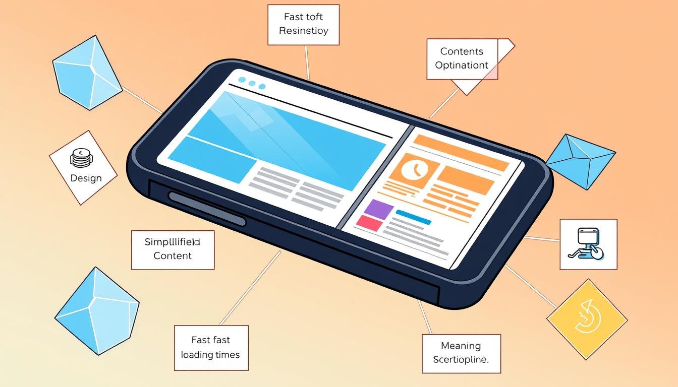
How to Optimize Content for Mobile Devices
More people use mobile devices to get information. Making content easy to read on small screens helps keep users interested. Here are some tips to make your content mobile-friendly.
Readable Content on Smaller Screens
Use simple language and clear structures for readable content. Keep paragraphs short to make them easy to see. Short, catchy titles also help grab attention fast.
People check their phones over 80 times a day. So, your content should be engaging and to the point. It shouldn’t overwhelm users.
Utilizing Chunking for Better Readability
Chunking means breaking info into smaller parts. This fits how people like to consume information. Studies show shorter lessons are more engaging.
Using bullet points and subheadings makes it easy to scan content. This helps users quickly find what they need. Simple formatting is key for easy reading on small screens.
Short and Impactful Titles
Creating catchy titles is crucial for getting attention. They should clearly summarize the content. With most searches coming from mobile, catchy titles can boost your site’s traffic.
A delay of just one second can lead to a 20% drop in conversions. So, every detail of mobile content optimization matters.
Enhancing Mobile User Experience
Creating a great mobile user experience is key to keeping users and boosting engagement. Important parts include easy navigation, quick load times, and design for one-handed use. These elements greatly affect how users interact with mobile content and their overall happiness.
Touch-Friendly Navigation
Touch-friendly navigation is vital for a better mobile experience. Users like big buttons, swipe gestures, and simple menus. This makes the site easier to use and encourages users to explore more. By focusing on design that’s easy for thumbs, businesses can make their sites better for all devices.
Fast Load Times
Quick load times are crucial for keeping users interested. Studies show that 53% of mobile users leave sites that take more than three seconds to load. To speed things up, compress images and cut down on HTTP requests. Fast load times mean fewer users leave and more conversions.
Design for One-Handed Use
Designing for one-handed use makes it easier for users to multitask. A clean layout with key features within reach makes the site easier to use. Making forms simpler for mobile can also increase completion rates. Fewer fields and autofill options reduce user frustration.
Mobile SEO Strategies
Mobile SEO is key to getting more users to visit your site. With more people using mobile devices, making your website mobile-friendly is crucial. Search engines like Google now look at the mobile version of a site first for rankings.
This change means your mobile site must be just as good as your desktop site. Using effective mobile SEO strategies helps improve user experience and increase conversions.
Mobile-First Indexing
More than 60% of search visits come from mobile devices now. Google’s mobile-first indexing means the mobile site should have the same content as the desktop site. If they don’t match, it can hurt your site’s ranking.
Google prefers responsive design. This makes the site work well on both mobile and desktop without needing different URLs for each.
Page Load Speed Optimization Techniques
Slow-loading sites lose users, with 53% leaving after three seconds. Making your site load faster can keep more users around. Here are some ways to do this:
- Optimizing images and assets for faster load times
- Minimizing server response times
- Using content delivery networks to reduce latency
- Employing caching techniques to speed up repeated visits
Google’s Core Web Vitals focus on user experience. They look at Largest Contentful Paint, First Input Delay, and Cumulative Layout Shift. These metrics show how important page load speed is for mobile SEO.
| Strategy | Description | Impact on SEO |
|---|---|---|
| Responsive Design | Adapts website layout for all devices | Boosts rankings due to optimal user experience |
| Mobile-Friendly Content | Short paragraphs and quick answers up front | Increases user engagement and retention |
| Page Speed Optimization | Techniques to reduce load time | Directly affects bounce rates and rankings |
| Local SEO | Optimization for location-based searches | Increases visibility for nearby consumers |
These strategies not only boost your search results but also make customers happier. With 67% of users more likely to buy from mobile-friendly sites, focusing on mobile SEO is smart for any business.
Conclusion
In today’s world, making content for mobile devices is a must. Over 52% of people visit websites on their phones. So, having a website that works well on mobile is key for businesses to succeed online.
With short attention spans, making content quick and interesting is crucial. If a site doesn’t load fast, 53% of mobile users will leave. This shows how important it is to make websites load quickly and keep visitors interested.
Using good mobile SEO and personalizing content can really help businesses. Putting call-to-action buttons in the right spots can increase conversions by 120%. By making these changes, companies can keep more customers and do better in their online marketing.
Source Links
- 10 Ways to Optimize Your Content For Mobile Users
- Mobile Optimization: What It Is & How to Do It Successfully
- How to Ensure Your Site Is Optimized for Mobile Search
- The Importance of Optimizing Your Content for Mobile Devices — Paperturn Blog
- How to optimize content for mobile devices
- How to Optimize Your Website for Mobile Devices
- Beyond Responsive Design: How to Optimize Your Website for Mobile Users
- Mobile SEO: Top Tips to Improve Your Mobile Rankings
- 10 Golden Rules to Optimize e-Learning Content for Mobile Learning
- Optimizing Mobile User Experience: Best Practices for Mobile-Friendly Designs
- Enhancing User Experience with Mobile Friendly Websites – Social Influence Web and Digital Lab
- How to Optimise Content for Mobile Users | Content Whale
- Mobile SEO
- The DIY Mobile SEO Guide: How to Be Mobile-First in 2024
- The Complete Guide to Mobile SEO: 8 Tips & Best Practices
- 5 Essential Tips to Optimize Content and Media for a Mobile-First Audience
- 7 Ways To Make Your Content Mobile Friendly